Why are some subjects photogenic and others aren't? Why are we touched by some images and not by other pictures?
Limiting myself here to landscape photography, the reasons are related to: the landscape itself; shape, light and colour.
Some landscapes have for some reason or another more 'emotional stopping power' than others - like mountain ridges, waterfalls or wind shaped trees. [ see also What is landscape? ].
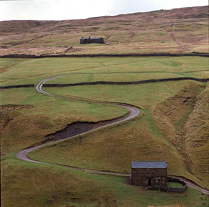
Shapes, especially those that support perspective, also make photographs attractive, for example stone walls around the fields or a meandering river [ see also Composition in 6x6 ].
Probably the most important ingredient of a good landscape photograph is the light - light suggesting depth or a dreamy atmosphere, light that adds colour to the sky and changes clouds into gold.
In my article Don't take it lightly I discuss the light through the day and the year, ever changing. Light that makes or breaks any interpretation of a landscape.
This article is about a narrowly related theme: colour. Colour is not only a quality of a subject, it also depends on the available light.
Some things are already discussed in the Don't take it lightly article.
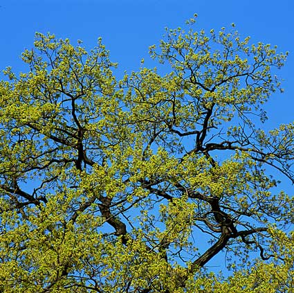
Colours in a landscape immediately tell you what time of year it is. Nature's colour palette changes in the course of the year. Brown, red and ochre mean autumn, white and greys go together with the winter. In spring the main colour is a fragile light green, changing slowly to the deep green and the shadows of high summer.
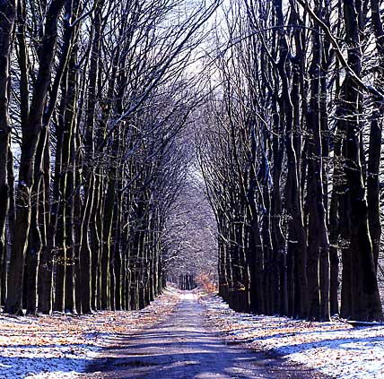 During winter and early spring the more subtle colours can be seen more distinctively than in the abundance of summer, when colours are 'heavier'.
Colours not only relate to the time of year and the general qualities of a landscape. They also interact with the emotions of the viewer, from happiness to melancholy. Yellowish colours are warmer and more comfortable than bluish ones. This is not always the case though: a deep blue sky and ocean is easily associated with some warm tropical island!
So the way we experience colour has a lot to do with the subject. A grey urban vista is depressing, while the same casts of grey in a wintry beachscape express the grandiosity of the landscape and the quiet of the moment.
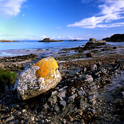
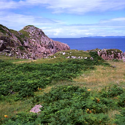 Apart from season, the main colours of living nature are green and brown. Rocks and earth tend to be far more grey and colourless. It is therefore quite striking to see more reddish rocks, like some kinds of sandstone. I guess that is also the reason why some deserts, like the Grand Canyon or the sanddunes of Namibia, are so spectacular. They totally differ from what we (inhabitants of more fertile areas) are used to.
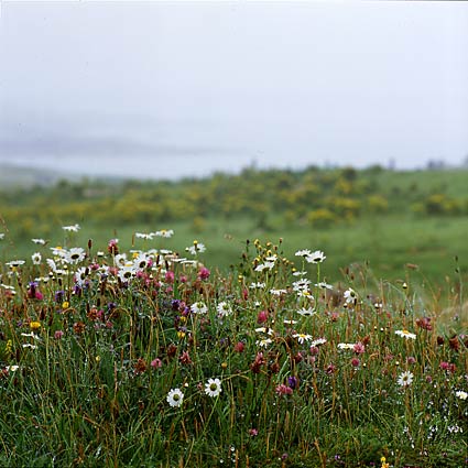
The counterpoints in this mostly green natural world are the flowers, especially so the yellow and red ones. Just a tiny bit of these change the face of a landscape.
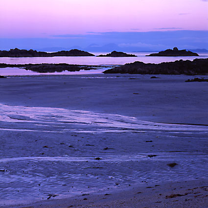
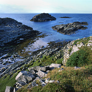
Opposite to all these colours is blue, as a kind of counterweight. When the weather is sunny the landscape has a blue ceiling and the waters take this colour as well. As a cool colour, blue tends to give way (while the red of flowers comes towards the viewer). It breathes space and air.
This is also the way a dark grey sky can make one feel depressed. It is like being pushed to the ground.
By the way, to my regret the sky is often colourless, especially just above the horizon. Sunny days without any clouds can be very uninspiring because of this.
Few colours are used by mankind that don't occur in nature (pure black maybe, though nature has a work-around in the shadows and at night). But the proportions are quite different. Just think about white washed houses, traffic signs and red letterboxes. Or monoculture lavender or rapeseed fields.
Green is a colour less used by homo sapiens, like sky blue. We tend to choose what is deviant.
 This is not to say that the combination of culture and nature doesn't have harmony. Unless, of course, human presence is stressed by using shiny building materials or yelling yellow raincoats...
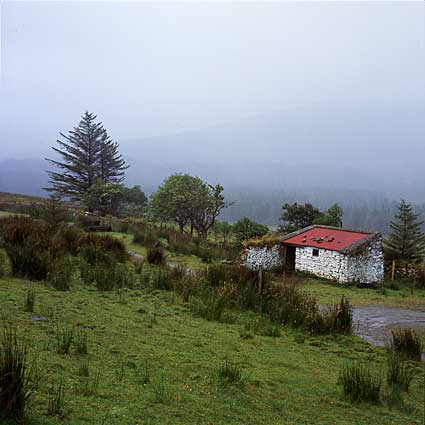
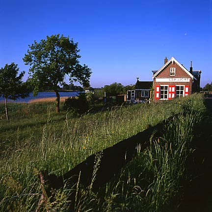
The nice thing about old building, be it chapels or ring forts, is their colour, almost absorbed by the landscape. They often consist of grey stonework, overgrown by ivy and mosses.
That may be the reason why they fit better in the landscape than such a radiating new business showroom. They attract less attention and seem to grow out of the earth.
Not all of these ancient building however have always had such a pastoral face. A good example are Greek and Roman temples, nowadays often admired for their serene marble grace. But at the time they were in use, they were painted with all kinds of colours. No serenity at all - big business!
Harmony may therefore be a question of being used to things. As soon as something has had it place for long enough, it is an intrinsic part of the landscape.
For the same reason many Dutch people love the old mills as part of Holland's cultural landscape - but those new windturbines are too ugly to tolerate.
A lot of art books discussing colours ascribe signal functions to several colours. Red for instance means danger, yellow means life and green is symbolic for peace.
I don't know what your experience is, but to me a red letterbox isn't instantly alarming - though it does attract attention.
On the other hand: colours have to do with mood. That is because, as I have said before, we link colours to seasons and temperature. We also talk about 'having the blues' or 'being browned off'.
So I conclude that colours can evoke a certain mood, but only within a certain context. Green and blue invite us to take rest and contemplate - not so though in the case of tax letters or police cars.
It is quite remarkable that different languages (and therefore cultures) classify colours differently. For example Gaelic (the Celtic language of Scotland) uses gorm for things English would call blue or green. Dorch can mean black as well as mere dark. And Latin flavus is about the colour of ripe cereals or a lion: somewhere between yellow and brown. The classification of colours in pre-industrial societies heavily depends on the available dye-stuffs, whether it be the purple (made of the purple snail) or lichens.
The idea of red, yellow and blue as primary colours (as many textbooks today take for granted) is less evident than one would think. But contemporary baby toys explain perfectly why everybody takes these colours as primary...
It is not only the classification of colours that differ among cultures - their symbolic meaning do as well. In Judaeo-Christian culture white is the colour of purity and sanctity - in China it symbolises death and mourning. And red: is it sensual or dangerous? (Or maybe those two qualifications are on the same after all?)
Does all of this mean that being a landscape photographer means walking through a landscape and think: 'I want to show something alarming in a moody surrounding - ahh, I'll take that red tractor in that fallow field'?
It doesn't work that - at least not for me. The emotional value of colours do explain why a certain subject or type of light attract more than normal attention and makes us reach for the camera. And why in the end the photograph means what it means.
 The making of a photograph is also about the quality of the colours, like primary versus secondary, obtruding versus giving way; like saturation and clarity.
The prime colours red, blue and yellow are more pronounced and emphatic than secondary ones like brown or pink. You need less of the former in a composition.
Red is the best example of this, as it almost jumps on the viewer. Blue can be used in far larger quantities. It seems to give way, doesn't attract much attention. The warmer a colour, the more it appears to come towards you. Cooler colours seem to creep away.
These obtruding and way giving qualities can be put to good use to support the suggestion of perspective. Because its main colour is blue, the horizon seems to be even further away, whilst the red of cornpoppies make you feel like standing in the midst of them.
As long as a photographer has a chance to, he will consciously or not give a red or yellow subject lots of space. Otherwise the picture would be out of balance, too loud. Of course, it certainly is possible to have the red or yellow subject large in the composition, in order to make a very 'intense' photograph - or a very annoying one.
 If you want to picture the urban dynamics, then traffic lights and signs are the thing for you. Lots of green and earthly shades are better used in a rustic landscape.
In general one can say that too many different colours make a photo restless, all the more so if many relatively obtruding colours are used. Lots of differents secondary colours, like in a flower field, tend to be not disturbing at all.
Another possibility is to use two equal strong colours. For instance I like green and blue in a fifty-fifty proportion. A stronger colour like yellow needs much more blue as a complement.
Using only one colour in a photo has a very special effect. Under some light circumstances a monochrome effect is achieved, even if the subjects has stronger colours under daylight.
As a last paragraph I'd like to mention some technical issues. Colour has a lot to do with the choice of films and papers and even more so with digital processing.
The colour rendering of a film is never entirely true to nature. Most films boost colours, because most people like that. Some critics may say that the abundance of plastics, advertisement and television with all their loud busyness has made the people of modern urban society colour blind. Only oversaturated films and prints are likely to get some attention by the image bombarded western consumer.
I think that this is probably true - although many 'primitive peoples' have also been using bright colours. Just ask the Picts!
 Even though photographs recorded on high colour saturation film, such as Fuji Velvia 50 or Agfa Ultra, do have a high 'wow' factor, I prefer the less emphatic colours of Fuji Provia or the portrait negative films. Nature's subtlity isn't complimented by 'Disneychrome' films.
But most people seem to use what all the professionals use and go for Velvia. I think that is a shame - professionals might be obliged by their markets; someone who wants to photograph the beauty of the earth should go for more true colours.
On the other hand: the Provia shots I took in Yorkshire in Februari were a bit too pale to my eyes. Admitted, the reality was rather pale, and the slides looked uninspiring.
The advent of digital processing (whether the original image was recorded digitally or scanned) means that the choice of colour tones and saturation moved down the chain. Not the choice of film beforehand, but the image processing after the fact decides the taste and bite of the colours - all the way from very subtle and muted to over the top and grotesque.
In my opinion this is a wonderful development, giving the photographer all kinds of options. It also offers countless ways to show off one's bad taste. But then again, about 25 years ago all kinds of filters hit the market, from rainbow to graduated mauve filters. It took some to time to discover that all those exciting new toys produced (almost) nothing but annoying images with a short life span. Powerful new tools always need to be used with care.
 |
 |
| How would you like it? Salt and vinegar? | |
As a very last point for the old fashioned film users (like myself): half a stop underexposure on slide film or a stop overexposure on negative film makes colours deeper and more saturated. Of course, slides become darker as well.
Light, bright colours can be achieved by overexposing slides a little. The same effect with negative film can only be had if you have your negatives printed. Underexposure only gets you muddy colours.
This article is written by Wim van Velzen, © 2003.
Comments on the article and photographs are welcome!The landscape photographs shown here and lots more are put in several portfolios!
It is also possible to order landscape prints or to use them editorially or commercially.