Since I entered the world of the internet, in 2000, I have become an addicted user. An hour a day though is still manageable. And it costs less than an hour in a pub.
The net satisfies my photographic hunger far better than magazines (and for technical issues even books) ever could. Because everyone can be his or her own publisher, there are far more different views and perspectives to be heard. On forums people can react, comment and give critique on each others photographs and technical knowledge.
Of course, there is a lot of bad information, sad photography and verbal abuse to be found as well. It is still human communication after all. One just needs to know where to stop reading.

Soon after I began to surf around, I decided to have my own site. I just started out as a parttime professional photographer. A website would be very nice to have as a marketing tool, because people could view the site as a kind of brochure. And maybe it would attract some people, who would otherwise not even know that I am out there.
At the school where I worked I did a course building educational websites, I read a few books on websites and HTML and off I went. June 2002 I started and had about 50 visitors a day. A year later this number had risen to 270. Not bad.
More than half the people who hired me as a wedding photographer this year found me on the web. I got lots of contacts with other photographers around the world. Nice, very nice.
In this article I have written in more detail about how I built my site. When I started making the site, I had three questions:
The first thing a potential web builder should do, is ask himself: 'why do I want to have a website; what do I want to achieve with it?' As the internet is about information and interaction, the question can be restated: 'what viewers do I want to attract, what do I offer them and how should they react on my site?'
As I try to be a professional photographer (albeit part-time), I had two things in mind: my site should be a marketing tool for my wedding photography and a showcase for my landscape photography.
As I decided to concentrate my professional energy on the wedding work, the landscape part could be a little more relaxed.

So the texts about wedding photography describe as clearly as possible the way that I work. Why I do what I do. The numerous galleries show my style.
This way, the website preselects my
potential clients. People who are looking for a completely different style or for those who find that I am far too expensive (or cheap!), won't contact me after seeing my site. And people who like my style, find all the information they want.
So the web is a better tool than an ad with just a name and telephone number in the yellow pages.
The aim of the landscape portfolios and the articles about landscape photography are to please and educate people about the countries that I cover and about landscape photography in general. Of course, I like it if I sell an image or print - but it is not the main aim of this part of the site.
As soon as I can dedicate more time to selling my landscape work, I will have to work on my site, to make it more commercial and user-friendly for photo-editors and the like.
OK - the site's purpose was clear to me. So what should be the content? What information should I offer and how should I order all that information?
Having surfed numerous sites, merely to get an idea of what I wanted my site to look like, I tried to sit in the viewer's seat. What would I like to know as a potential client? What would I like to see as a fellow photographer?
And so I made (with some changes this year) a few main pages: home, wedding, landscape & nature, articles, about the photographer, contact. Pricing and technique are on a second level (linked to weddings and landscape & nature) as well as other reportages and portraits.
To raise usability, I added a search page and a what is new? section.

Wedding galleries and landscape portfolios - offering thumbnails - are on a second level as well, to be reached through the wedding and landscape & nature pages. Clicking the thumbnails brings the viewer to the third (and deepest) level, that the individual images.
The same applies to the articles. These are listed on the articles page.
A decision I made right from the start is to offer the whole site both in English as in Dutch. I could have chosen to have the wedding section in Dutch only, as 98% of my wedding clients have Dutch as their first language. But as most contacts with fellow photographers are in English (thanks to a number of forums I participate in), I decided to do the entire site in both languages.
Of course, this results in some extra work, but it is definitely worth it.
And here I have to mention my fellow photographer Keith Laban and thank him for checking the English texts of the articles. All remaining mistakes and weirdisms are my fault only!
Before the launch of the site, I asked some people to read the existing texts. One of most useful comments was that the texts had too much input from my own perspective. I told my readers what I was doing, in stead of showing them what they would get if they hired me as a photographer. In other words, I had to rewrite the site from the readers' perspective - giving information on the services that they could find.
I knew who I wanted to reach with the site, what information should be offered. One question remained: what look should my site have? As one never gets a second chance to make a first impression, this is a very important point.
One thing was for sure: it should reflect my style of photography and albums. Simple, no 'tricks' or gimmicks. Information should be easily found and be readable.
Readability on the web is different than in a good looking book. Paragraphs should be shorter. Navigation has to be clear, as a site isn't linear.
In order to display my photographs at their best, I opted for a black background and white text. The main navigation is at the top of each page, without any frames.
As a matter of principle I avoid every use of scripts, flash etc. (apart from the search function). It gives a cleaner look, takes less time to download and reflects my quest for a simple well balanced presentation.

In order to get the site's maintenance
manageable, I switched after a couple of months to Cascading Style Sheets. These help me to make the presentation of all pages uniform and if I want to change something, I just have to do it once - like the colour of links or the font size of all captions.
Some (very) old browsers cannot cope with CSS and make a mess of my site. After trying to cure these problems, there seems to be only two solutions: offering everything without CSS as an alternative - or say goodbye to those digital dinosaurs. I did the latter.
For those who are interested in the hardware and software I used:
School offered me a licensed MS FrontPage
packet. I tried to get used to it, but soon decided that I'd rather work in notepad, as I actually like making my own HTML (I know, I am a bit weird). I only use
FrontPage to correct my spelling and once in a while to discover broken links.
Doing everything in notepad has a clear advantage over FrontPage or most other editors: it uses the least amount of codes, keeping download times to a minimum.
All photographs on this site have been scanned on an Epson Perfection 1640SU (with transparency adapter). Works great for web use and smaller prints. An excellent review can be found on Paul Butzi's site.
Photoshop Elements is used to process the scans: colour correct them, get rid of the dust, sharpen for web use. I don't do any digital manipulation - I use the software to get the computer image and the slide to look as similar as possible.
This article is written by Wim van Velzen, © 2003.
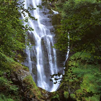
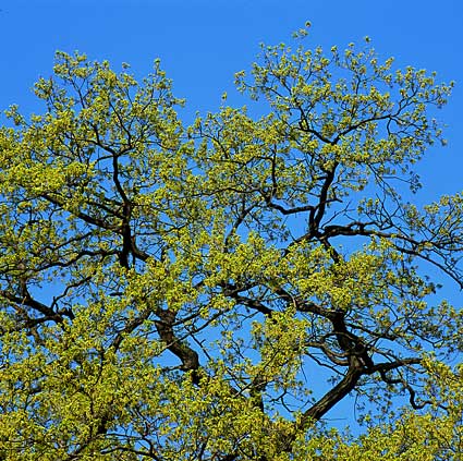
Comments on the article and photographs are welcome!The landscape photographs shown here and lots more are put in several portfolios! More wedding photos can be found in the wedding galleries.
It is also possible to order landscape prints or to use them editorially or commercially.